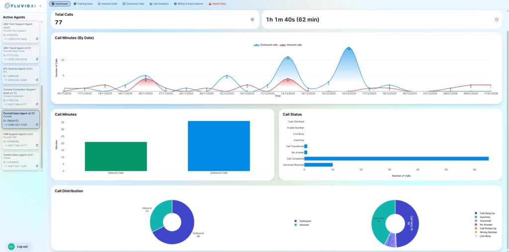
The Dashboard provides a high-level, real-time view of how your AI agents are performing across both inbound and outbound calls. It summarizes total call volume, call duration, inbound vs outbound distribution, and call outcomes over time, allowing you to quickly spot trends, usage patterns, and engagement levels at a glance. This view is designed for monitoring and insight—not configuration—so you can understand how your agents are being used, how conversations are resolving, and where follow-ups or optimizations may be needed, without digging into individual call records.
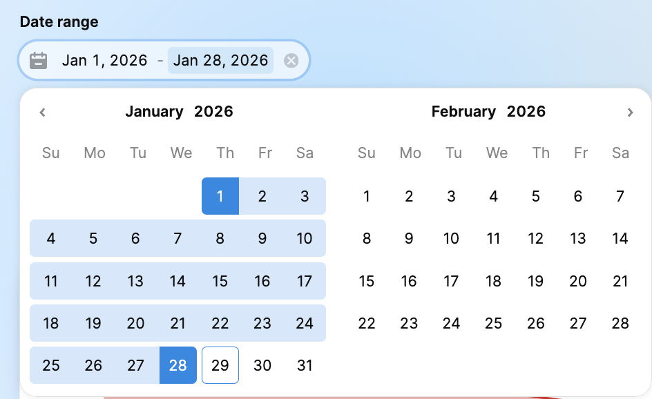
1. Date Range Filter
Located at the top left, this filter controls the data displayed across all widgets on the dashboard.
Default View: Shows data for the current month.
Custom Range: Click the calendar icon to select a specific start and end date to analyze performance over a custom period.
2. Key Metrics (Overview Cards)
These cards provide high-level statistics for the selected date range:
Total Calls: The aggregate number of inbound and outbound interactions handled by the agent.
Total Duration: The total amount of time the agent spent interacting with customers (displayed in Hours, Minutes, and Seconds).
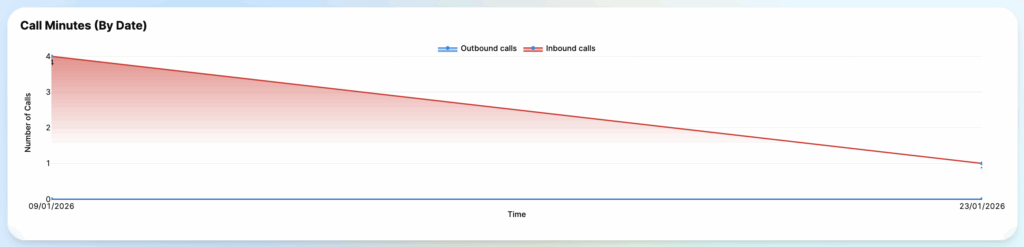
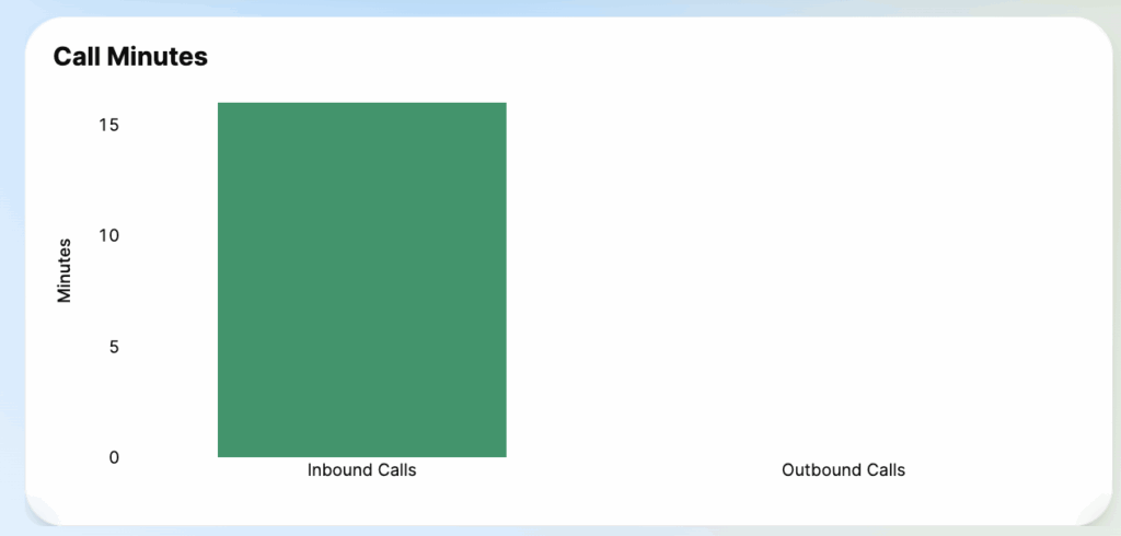
3. Call Analytics Graphs
Visualize your call traffic patterns:
Call Minutes (By Date): A line graph showing the trend of call volume over time. Use this to identify peak days or operational downtimes.
Call Minutes (Bar Chart): Compares the total duration of Inbound (Green) vs. Outbound (Blue) calls.
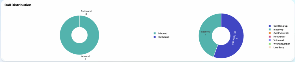
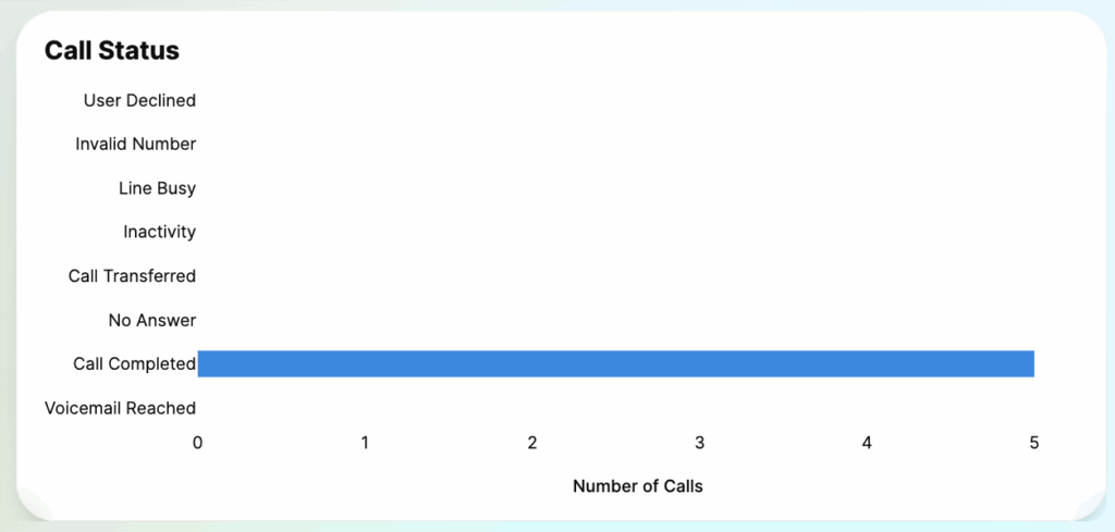
4. Call Distribution & Status
Deep dive into the nature of your calls:
Call Distribution (Pie Chart): Percentage breakdown of Inbound vs. Outbound calls.
Call Outcome (Donut Chart): Analyzing how calls end (e.g., Call Hang Up, Inactivity, Voicemail).
Call Status List: A detailed legend showing the count for specific disconnection reasons (e.g., User Declined, Invalid Number, Line Busy).